COMPOSITION & TYPE
Above are my two poster designs I made for The "Big Band Blowout" Performance. Using just black and white (white for the background and black for the type) is a real challenge. Though I don't use much colours when designing posters or themes; and Black & White are my favourites, but the limit of colour this time (no opacity also) made me stuck in some arrangment steps.
However, after the critique in class, I found more solution for my works and did some editing to make it more impressive.
I have some explanation for those two posters (same contents - different fonts)
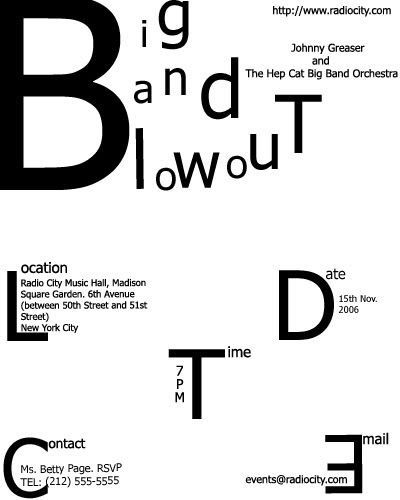
The First (in Tahoma)
I found a common in 3 words Big, Band and Blowout that they all begin with a "B", so I made the B biggest to be a main press in the poster. All the left letters are arranged like a rhythm in music. The L, D, T, C, E in bigger sizes to take notice from the viewers for important information. The name of the performer is put at the right margin, next to the Performance name to be easily seen who will be in the show. The website address I put on top of the poster, the reason for this is, most poster I see the address is at the bottom whereas the website is the second place people will find useful information about something somewhere without going there.
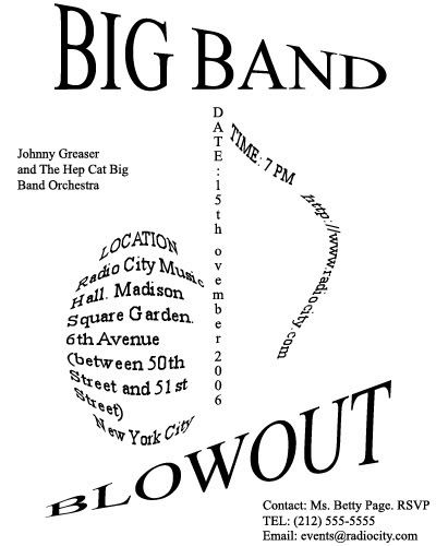
The Second (in Times New Roman)
BIG BAND and BLOWOUT are made to have the effects: one comes from back to front and one comes vice versa, both strings meet in a visual point in space to show relation. This poster is made for a musical performance so I think of grouping information to make a "musical note" as you can see above. The time I put next to the location and the webpage, but the webpage in italic so they are seperate informations. Name of the performer is near the "musical note"so that you can easily see the interaction and influence between them. The Contact Group was put in the right corner in normal form and position. I think you shoul make those elements (address, phone numbers, and other numbers) readable whether it's stylized or not.
posted by EMERALD @ 6:49 AM
3 Comments
![]()

3 Comments:
I can appreciate your attempt to be creative with you typography. Your relation to music in the first composition in clear, though it can be at the expense of readability. The main goal of this exercise was to effectively organize a block of text into logical groups. You were able to separate the text into groups, and in both cases, perhaps too many. For example, I am not convinced with leaving the website address alone in the top of the first composition. In the second, the eye is forced to move around the page too many time and as a result seriously affects the ease of communicating the information. You will learn more about this when we discuss design and the grid in class. Design is as much problem solving as it is creative.
Mr Rich has said all things possible about your pieces. They are really great! In my opinion I think that the music note is not clear and it took me a few minutes to recognize. Another thing is that these words "Location" "time" "email" should be put at the same position to create rythm and make them easier to read.
I like your first poster. I like the way you exaggerate the beginning of each group such as time, location....This makes the viewer not only easier to find necessary information but also impressive. However, to my opinion, the web address should be put somewhere else to strengthen the title.
The second poster, the idea is clever because this is the concert and you put the information to create the music note but it is hard to read.
Post a Comment
Subscribe to Post Comments [Atom]
<< Home