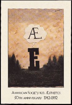
Type has meaning whether it stands alone or is combined with other texts, other images. Art designs that work out the meaning in effective way are not many. So I began to find works like that rather than the pictures were shown in class. One of the nice applications of typography I have found is the poster made by Saul Steinberg. He made the poster to celebrate for the American Society for Aesthetics’ 50th anniversary.
The thought balloon is where the meaning begins. The meaning, in one hand, support for the purpose of the anniversary, very clear with the text below the picture; in the other hand, it made people think, deeply. According to the author of the article, Saul, in this work, made people think of personal perfection. The E in the picture thinks of or even dreams of the way it look like. The “E” was personalized, like anyone of us, we often wish for the more perfect one for our nose, hair, hands, body …, the “E” here thinks of the diphthong that it dreams to be. The thought showing the desire created a gentle wish with strong passion. We can link the meaning for person to the hidden tone inside the picture for “E”, there worked out the concept of the poster. It’s simple yet dynamic.
References:
posted by EMERALD @ 2:10 AM
0 Comments
![]()

0 Comments:
Post a Comment
Subscribe to Post Comments [Atom]
<< Home