Thursday, November 30, 2006

SAIGON OPEN CITY Reflection


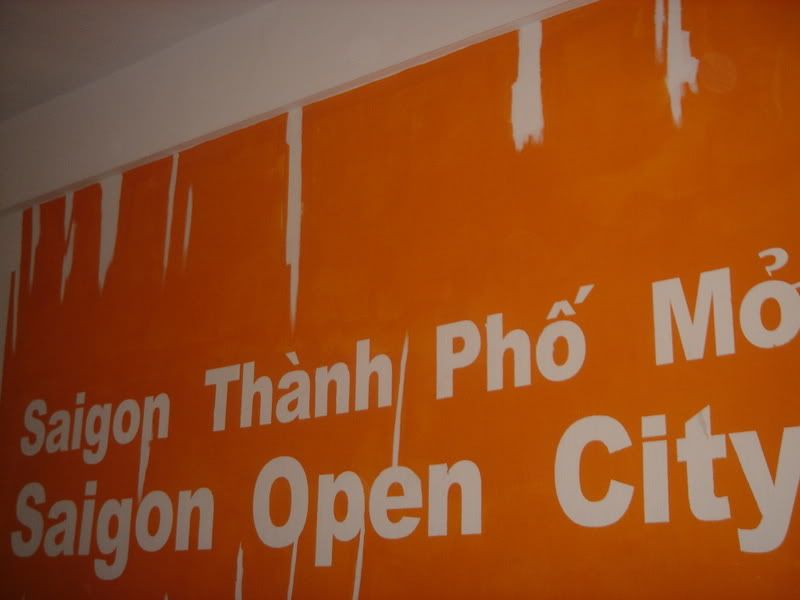
Have to say that was the first time I visited an Art place that gave me so many thoughts and feelings like in SOC.

I was not surprised when getting there, small building and no decoration at the front. I was either surprised or disappointed because not many Art places in Vietnam have good infrastructure or well decorated. The real fact is the investment is not much for the artist or people doing Art in Vietnam up to now. Also from seeing the website online, I know this is a private company and this means budget to do the work will be larger.

Attending the talk and hearing comments made me step by step reach closer to the problem. If there were no commands about the work then I myself could not realize the SOC was on the way solving too many problems at this stage.

I heard all the comments and also the two writers’, what I didn’t feel pleasant was their commands were somehow biased and personal. I don’t know if they already or not join the process of doing this, but at least they should say something to encourage what the group had poured effort to do, rather than just complaining about the beginning stage of the group. They likely wanted to show the errors for everyone to see but not suggest any solution for them to fix and develop. Why just keeping pointing out errors? Is it really trick like that or I’m kind of easy? Either ways, their commands played an important role on that day and I knew I have too many things ahead to experience.

I always think of the day when not only us - the students study design - but all people can have the chance to get a closer look into Art. There will be a day when Art is no longer thought as a hard concept to get involve, a luxurious or sublime “thing” just can be “hung” on the wall, exhibited in galleries. Here and now Vietnam has a chance to do that, difficulties stay ahead, challenges can be everywhere, every time. We have to stay together and push it go further.

Just think of an art work you made, if your style is not along with the way people often see things, feel things; it can be objectionable and takes time to be adopted though it perfectly please you. Art process is more than that, it not only needs time (which already took for too long) but also supports, human resources, money … to be able to run and maintain. That’s quite a lot of works to do. Not simple.

That’s Chapter 1 of it. Like reading story, if you don’t reach to the very end, you cannot say the story good or bad, successful or failed.

Sunday, November 19, 2006

PANGRAM

Whenever you load a font type on the web and save it to your computer, you will see the type example in the font folder. Most of the time I viewed the type fonts, there are the alphabets or the name of the fonts which show how the font will appear when it's in use.

Until recent, I knew that there is another way to show the fonts rather than the boring alphabet (enough character) or the font name (not enough character), that's called pangram. Pangram is defined as a piece of text that contains all the alphabet character at least once. Most of the pangram is short and single sentence. They are used to present the typefaces.

There are many pangrams in many languages. The sentence in English above is quite popular and easy to understand.


I also found a web which illustrate the sentence into images.

TYPOGRAPHY


Type has meaning whether it stands alone or is combined with other texts, other images. Art designs that work out the meaning in effective way are not many. So I began to find works like that rather than the pictures were shown in class. One of the nice applications of typography I have found is the poster made by Saul Steinberg. He made the poster to celebrate for the American Society for Aesthetics’ 50th anniversary.

The thought balloon is where the meaning begins. The meaning, in one hand, support for the purpose of the anniversary, very clear with the text below the picture; in the other hand, it made people think, deeply. According to the author of the article, Saul, in this work, made people think of personal perfection. The E in the picture thinks of or even dreams of the way it look like. The “E” was personalized, like anyone of us, we often wish for the more perfect one for our nose, hair, hands, body …, the “E” here thinks of the diphthong that it dreams to be. The thought showing the desire created a gentle wish with strong passion. We can link the meaning for person to the hidden tone inside the picture for “E”, there worked out the concept of the poster. It’s simple yet dynamic.

References:

How Saul Steinberg defined aesthetics in a nutshell

Saturday, November 11, 2006

HEAVEN & EARTH


I visited one site of an oil painting artist: Anselm Kiefer

His works make me feel of old type drawing with patterns here and there, and a special image repeated in his works: a snake. In the article written about his exhibition, they explained the snake is used as a symbol of himself. That interests me.

And yes, I found a painting named “Resurrexit” (1971) in his galleries and it did have conceptual meaning and also related to my lesson in class. You can see at once: symmetrical, balance is really in the painting.

At first I just think of a lonely snake coming nearer to the end of the wood and totally didn’t notice of the wood stair on top of the picture. I think the stair is another picture, but after reading the explanation, I know it has the relation between it and the wood with the snake.

As it was explained, the very far point at the end of the wood, there is a building and the snake headed to it. The pinewood stair on the top of the pictures is thought to be a stair leads to heaven. However, Kiefer had converted his studio into the building and pinewood stairs are the only access to the studio. So we can understand where is the link and why is it.

Below is another painting which also has the Snake


AN EXPLOSION OF LIGHT


In October, 2006, there was an impressive Art painting exhibition in Brookville named “Whirling in the nebula” by Laurette Gnaegy Kovary. What would definitely surprise and please you is the position of the woks. They were hung on the ceiling and nicely arranged.

It’s said her waterfront studio in Bayville is tight so she painted horizontally on clear plastic panel and hang them vertically. The “explosion” meaning in her work when the colours combined with sun lights pouring on creates a final visual view of the universe.

The sun light, as we know, is created with the combination of many colors inside so that it will have effects on subjects it pour light onto. The paintings hung there will have their colors mixed with sun light and transparent materials to make a new feeling, new experience for the viewers. They are not hard to see or understand, on the contrary very close with our thoughts and easy to strongly absorb.

This is a new way I have learned thanks to this article. What is combined with nature always has strong impression.

Source:

An Explosion of Light, Marcelle S. Fischler (November 11, 2006)

Friday, November 10, 2006

DEATH & LIFE


I accidentally saw this picture and felt there is strong use of hot colours and as a result it leads to strong and attractive impression for the viewers.

The artist of that picture is Tom O'Malley, he graduated from a University with BA in Illustration. If you take a look of his portfolio, you will see that he often adds some kinds of straight lines and circles into his work as his own style.

The picture above was drawn with flowers growing from the mouth, the orange lines added around them to effectively increase the brightness for hope in life. And the whole picture with the man's head is like a plant with roots, leaves and flowers.

If you see in more details, you can see half of the head was coloured with bright level colours (bright orange, yellow, red), which we already know they represent for pure, hope, love ... And the other one was coloured with darker levels of those colours.

The contrasts bewteen two parts and the main "plant shape"created a link between life and death. The head's direction also has its meaning, looking up, receiving all the sun lights and beauty of life though it's known there is death behind anytime. An optimistic meaning.

Source & Reference:
Computer Arts
Tom O'Malley Portfolio

Wednesday, November 08, 2006

COMPOSITION & TYPE

Above are my two poster designs I made for The "Big Band Blowout" Performance. Using just black and white (white for the background and black for the type) is a real challenge. Though I don't use much colours when designing posters or themes; and Black & White are my favourites, but the limit of colour this time (no opacity also) made me stuck in some arrangment steps.

However, after the critique in class, I found more solution for my works and did some editing to make it more impressive.

I have some explanation for those two posters (same contents - different fonts)


The First (in Tahoma)
I found a common in 3 words Big, Band and Blowout that they all begin with a "B", so I made the B biggest to be a main press in the poster. All the left letters are arranged like a rhythm in music. The L, D, T, C, E in bigger sizes to take notice from the viewers for important information. The name of the performer is put at the right margin, next to the Performance name to be easily seen who will be in the show. The website address I put on top of the poster, the reason for this is, most poster I see the address is at the bottom whereas the website is the second place people will find useful information about something somewhere without going there.


The Second (in Times New Roman)
BIG BAND and BLOWOUT are made to have the effects: one comes from back to front and one comes vice versa, both strings meet in a visual point in space to show relation. This poster is made for a musical performance so I think of grouping information to make a "musical note" as you can see above. The time I put next to the location and the webpage, but the webpage in italic so they are seperate informations. Name of the performer is near the "musical note"so that you can easily see the interaction and influence between them. The Contact Group was put in the right corner in normal form and position. I think you shoul make those elements (address, phone numbers, and other numbers) readable whether it's stylized or not.