BOOK COVER
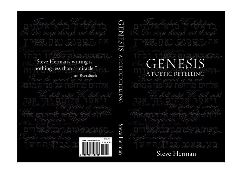
The first cover book is for Genesis in Poem. There are words made in script type and also some light colour letters behind that we can still see them seperately. The book cover is made in black and white, simple and silent like we read poem, we need space to feel and understand. The GENESIS letter is put on top with biggest size to emphasize the main topic in the book. At the bottom of the page there is the writer's name - in the center to make it easy to see. The style is simple but that's basic and suitable to the taste of the reader.
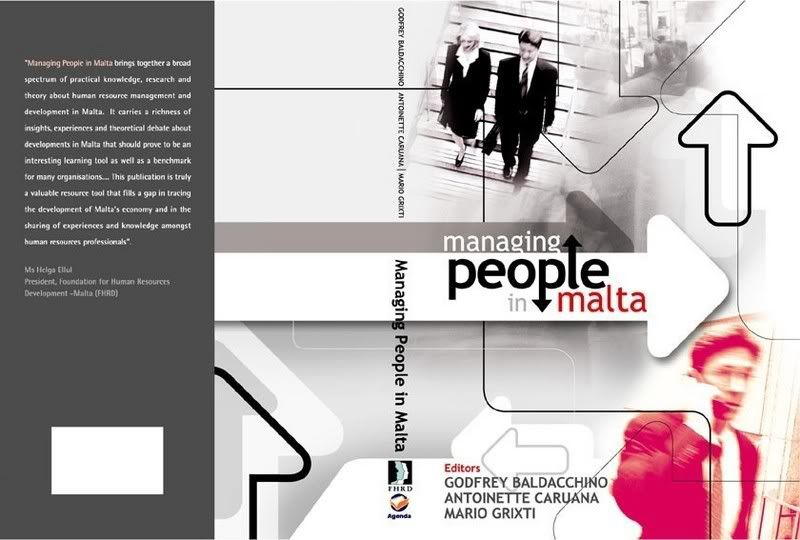
The cover is designed in the active style with light tone. Symbol and icon is used to make the meaning. Arrangment also made like in a work environment with the arrows like the steps or grids meet together to make a busy view. The pink colour at the right corner can be made to mark the outstanding, look into the image we can see the determination in his face. So the pictures and colours fit well with the concept.
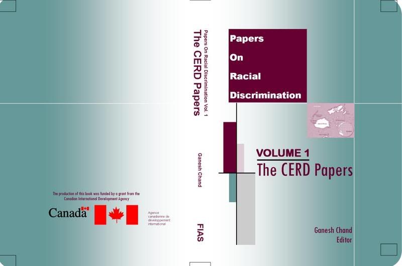
The Racial Discrimination is best presented in grids layout - it make the meaning more powerful and the lines also remind us to the barriers, fences which prevent people getting together.
posted by EMERALD @ 4:54 PM
1 Comments
![]()


1 Comments:
I have some comment of three books:
The first one is interesing with many textual decoration as background.However the title seems to be not impressive
I like the second one best, pointing arrows with many ways, pictures of business people working, blurry man. It related closely to the busy and fast working of business people.
In the final one is nice too, the isolated and small map between lines and plain areas represents well the concept "Discrimination"
Post a Comment
Subscribe to Post Comments [Atom]
<< Home